


Interior design trends continue to evolve, yet some approaches stand the test of time by offering both simplicity and sophistication. Tonal decorating has emerged as a refined technique that transforms spaces through the strategic use of a single colour palette. Rather than relying on contrasting hues or bold accent walls, this method embraces subtle variations of one dominant shade to create cohesive, harmonious environments. The appeal lies in its ability to add depth and interest whilst maintaining a sense of calm and continuity throughout a room.
What is tonal decorating ?
Understanding the core concept
Tonal decorating refers to the practice of designing an interior space using multiple shades, tints, and tones of a single colour. This technique moves beyond painting everything the same flat shade, instead incorporating lighter and darker variations to establish visual layers. The approach creates dimension through subtle gradations rather than stark contrasts, allowing one colour family to dominate the entire aesthetic.
The method distinguishes itself from monochromatic schemes by emphasising texture and material diversity. A tonal room might feature:
- Pale cream walls paired with deeper beige upholstery
- Soft grey curtains alongside charcoal cushions
- Light blue painted surfaces complemented by navy accents
- Varying finishes such as matte, gloss, and satin within the same colour range
The psychology behind single-colour schemes
Colour psychology plays a significant role in how tonal decorating affects mood and perception. When a space commits to one colour family, it creates a unified atmosphere that can feel either soothing or energising depending on the chosen hue. Blue tones typically promote tranquillity, whilst warmer shades like terracotta foster comfort and intimacy. The absence of jarring colour shifts allows the eye to rest, reducing visual clutter and creating a sense of spaciousness even in smaller rooms.
This understanding of colour impact naturally leads to considering the practical advantages that tonal schemes offer homeowners and designers alike.
The benefits of monochrome decoration
Creating visual harmony and flow
One of the most compelling advantages of tonal decorating is its ability to establish seamless visual flow throughout a space. Without competing colours vying for attention, the eye moves effortlessly from one element to another. This creates an elegant continuity that makes rooms appear larger and more cohesive. The technique proves particularly effective in open-plan living areas where distinct zones require subtle definition without harsh boundaries.
Simplifying design decisions
Working within a single colour palette significantly streamlines the decorating process. Rather than agonising over whether accessories clash or complement existing elements, designers can focus on texture, form, and proportion. This constraint paradoxically offers greater creative freedom, as nearly any item within the chosen colour family will integrate successfully into the scheme.
| Design aspect | Traditional approach | Tonal approach |
|---|---|---|
| Colour coordination | Complex matching required | Simplified selection process |
| Visual cohesion | Risk of clashing elements | Inherent harmony |
| Room perception | Can feel busy or fragmented | Appears spacious and calm |
| Timelessness | Trend-dependent | Classic and enduring |
Enhancing architectural features
Tonal schemes allow architectural details to take centre stage. Without competing colours, elements such as mouldings, alcoves, and structural features become more prominent. The subtle play of light and shadow across varying tones highlights spatial dimensions that might otherwise go unnoticed in more colourful environments.
Understanding these benefits provides a foundation for making informed choices about which specific hue will work best in your particular setting.
How to choose the right colour for your space
Assessing natural light conditions
The amount and quality of natural light fundamentally influences how colours appear throughout the day. North-facing rooms receive cooler, indirect light that can make certain shades appear flat or dull, whilst south-facing spaces benefit from warm, consistent illumination that enhances most tones. Before committing to a colour, observe how paint samples look at different times of day and under various lighting conditions.
Considering room function and mood
Each space serves a distinct purpose that should inform colour selection. Practical considerations include:
- Bedrooms: opt for calming tones like soft blues, gentle greens, or warm neutrals
- Living areas: choose versatile shades that accommodate various activities and moods
- Home offices: select colours that promote focus, such as muted greys or sage greens
- Kitchens: consider practical, light-reflective tones that create an inviting atmosphere
Testing before committing
Professional designers recommend painting large sample boards rather than small swatches. Apply several variations of your chosen colour family to observe how different tones interact with existing furnishings and architectural elements. This investment of time prevents costly mistakes and ensures the final result meets expectations.
Even with careful planning, certain pitfalls commonly trap those new to tonal decorating, making awareness of these challenges essential for successful implementation.
Common mistakes to avoid with tone-on-tone design
Creating insufficient contrast
Whilst tonal decorating relies on subtle variation, too little contrast results in flat, lifeless spaces. The scheme requires enough differentiation between the lightest and darkest tones to establish depth and visual interest. A successful tonal room typically spans at least three to five distinct shades within the chosen colour family, ensuring adequate dimensional quality.
Neglecting texture and pattern
Without colour variety to provide interest, texture becomes paramount. A common error involves selecting items solely based on colour match whilst ignoring tactile diversity. Incorporate:
- Woven fabrics alongside smooth surfaces
- Glossy finishes contrasted with matte elements
- Subtle patterns that add movement without introducing new colours
- Natural materials that provide organic variation
Forgetting about undertones
Colours contain underlying hues that become apparent when placed together. A seemingly straightforward grey might reveal blue, green, or purple undertones depending on surrounding elements. Failing to account for these subtle differences can result in a scheme that feels disjointed despite technically remaining within one colour family. Always compare samples side by side to ensure undertone compatibility.
Learning from these mistakes helps avoid common pitfalls, whilst examining successful real-world applications provides concrete inspiration for your own projects.
Inspiring examples of tonal decorating in 2026
Warm terracotta living spaces
Contemporary designers have embraced earthy terracotta palettes that range from pale peachy tones to deep burnt orange. These schemes incorporate rust-coloured upholstery, clay-toned walls, and copper accents to create spaces that feel both modern and timeless. The warmth of this colour family proves particularly effective in rooms seeking a cosy, grounded atmosphere.
Sophisticated sage green environments
Sage green has emerged as a versatile choice for tonal schemes, offering a connection to nature whilst maintaining sophistication. Successful implementations layer olive furnishings with mint accessories and deeper forest accents. This palette works exceptionally well in spaces seeking tranquillity, from bedrooms to home offices, providing a refreshing alternative to cooler blue-grey schemes.
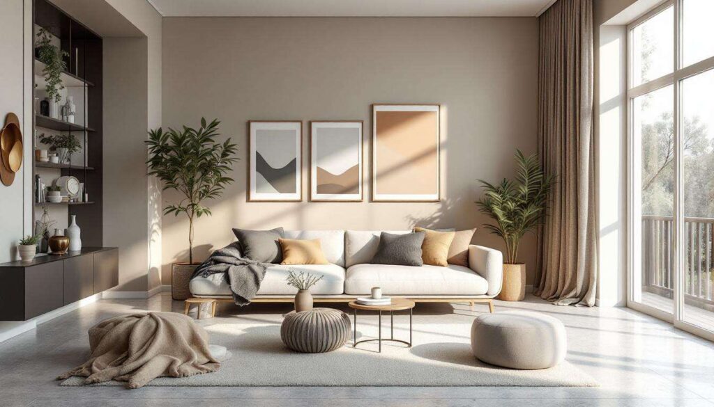
Elegant neutral compositions
Neutral tonal decorating continues to dominate, with designers pushing beyond basic beige into more nuanced territory. Contemporary neutral schemes might combine:
- Warm oatmeal walls with linen upholstery
- Cream painted woodwork alongside natural jute textiles
- Soft taupe surfaces complemented by darker mushroom accents
- Layered white tones with varying undertones for subtle complexity
These real-world examples demonstrate the versatility of tonal decorating, providing a springboard for understanding how to implement similar approaches in your own home.
Techniques for applying tonal decor in your home
Starting with a foundation colour
Begin by selecting a mid-tone shade as your anchor colour. This becomes the reference point from which lighter and darker variations extend. Apply this foundation to the largest surfaces, typically walls, then build outwards with progressively lighter or darker tones on furnishings, textiles, and accessories. This methodical approach ensures balanced distribution across the space.
Layering through the 60-30-10 principle
Adapt the classic design rule to tonal decorating by allocating:
- 60 per cent: dominant mid-tone on walls and large furniture pieces
- 30 per cent: secondary lighter or darker shade on upholstery and curtains
- 10 per cent: accent tone in the darkest or lightest variation for visual punctuation
Incorporating metallic elements
Metallic finishes provide reflective interest without introducing competing colours. Brass, copper, and gold complement warm tonal schemes, whilst chrome, silver, and pewter enhance cooler palettes. These elements add subtle glamour and help define spaces through strategic placement on lighting fixtures, hardware, and decorative objects.
Using paint techniques for depth
Advanced applications might employ specialist paint techniques such as colour washing, ombré effects, or subtle gradients that transition between tones. These methods create sophisticated visual movement whilst maintaining the monochromatic integrity of the scheme. Even simpler approaches like painting adjacent walls in slightly different tones can add architectural interest to otherwise plain rooms.
Tonal decorating offers a refined approach to interior design that prioritises harmony and sophistication over visual complexity. By working within a single colour family, this technique creates spaces that feel cohesive, spacious, and timelessly elegant. The method’s success depends on careful attention to contrast, texture, and undertones, transforming what might seem like a limitation into an opportunity for creative expression. Whether implementing warm terracotta schemes, calming sage palettes, or sophisticated neutral compositions, the principles remain consistent: layer multiple shades thoughtfully, incorporate diverse textures, and allow architectural features to shine. This approach proves that restraint in colour choice need not mean restraint in visual impact, demonstrating that sometimes one colour truly can do all the work in creating a beautifully designed room.