


The shift from blush pink to berry tones marks a significant evolution in interior design preferences. Homeowners and decorators alike are embracing these richer, more sophisticated hues that bring warmth and depth to living spaces. This transition doesn’t require a complete overhaul of your existing décor. Instead, strategic additions and thoughtful styling choices can introduce these trending colours seamlessly into your home, creating a fresh aesthetic without the commitment and expense of repainting entire rooms.
Trends 2026: why berry tones are appealing
The psychology behind deeper hues
Berry tones encompass a spectrum of plum, burgundy, mulberry, and wine-inspired shades that evoke feelings of comfort and sophistication. Unlike the delicate sweetness of blush pink, these colours offer grounding energy whilst maintaining a sense of warmth. Design psychologists note that deeper tones create intimate atmospheres, making spaces feel more cocooning and personally connected to inhabitants.
Sustainability and longevity in design choices
The movement towards berry tones reflects a broader shift in consumer preferences. Homeowners increasingly seek timeless colour palettes that won’t feel dated within a season. Berry shades possess remarkable versatility, working equally well in traditional and contemporary settings. This longevity aligns with sustainable design principles, reducing the need for frequent redecoration cycles.
| Colour characteristic | Blush pink | Berry tones |
|---|---|---|
| Mood impact | Soft, youthful | Rich, sophisticated |
| Versatility | Limited pairings | Wide compatibility |
| Longevity | Trend-dependent | Classic appeal |
Understanding why these colours resonate with current design sensibilities provides the foundation for incorporating them effectively into your existing spaces.
Integrating berry tones into your décor without repainting
Strategic colour placement techniques
Introducing berry tones requires careful consideration of existing colour schemes. The most effective approach involves identifying neutral areas within your rooms where deeper hues can create visual interest without overwhelming the space. Focus on accent walls using removable wallpaper, large-scale artwork, or textile wall hangings that can be changed as preferences evolve.
Working with your current palette
Berry tones complement numerous existing colour schemes. They pair beautifully with:
- Neutral greys and warm beiges
- Soft creams and ivory shades
- Deep navy and forest green
- Metallic accents in gold, brass, and copper
- Natural wood tones from light oak to walnut
The key lies in balancing proportions. If your room features predominantly light neutrals, berry accents create dramatic focal points. In spaces with existing darker elements, berry tones can bridge colour transitions, creating cohesive flow between disparate elements.
Once you’ve identified where berry tones can enhance your space, selecting appropriate furniture pieces becomes the next consideration.
Choosing the right furniture to highlight berry tones
Statement pieces versus subtle integration
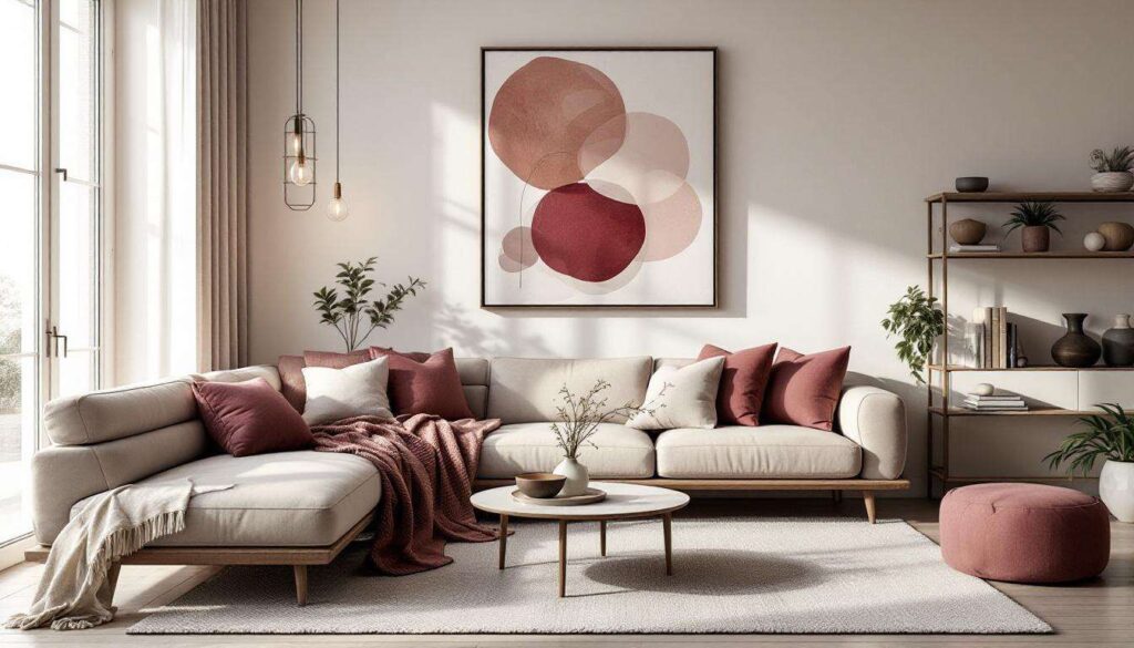
Furniture offers an excellent opportunity to introduce berry tones with significant visual impact. A single statement piece, such as a velvet armchair in deep mulberry or a burgundy sofa, can anchor an entire room’s colour scheme. This approach works particularly well in living rooms and bedrooms where seating becomes a natural focal point.
Upholstery considerations
When selecting upholstered furniture in berry tones, fabric choice significantly affects the overall impression:
- Velvet: enhances colour depth and adds luxury
- Linen: softens intense hues for casual elegance
- Leather: creates sophisticated, masculine energy
- Bouclé: offers texture whilst maintaining colour richness
Smaller furniture additions
For those hesitant about large furniture commitments, occasional chairs, ottomans, and poufs in berry tones provide flexibility. These pieces can be repositioned throughout your home, testing how the colours work in different lighting conditions and alongside various existing elements before making larger investments.
Beyond furniture, textile accessories offer another layer of colour integration that’s easily adjustable to personal preferences.
Accessorising with berry tones: cushions, rugs, and curtains
Layering textiles for depth
Soft furnishings represent the most cost-effective and flexible method for introducing berry tones. Cushions allow experimentation with different shades within the berry spectrum, creating visual interest through tonal variation. Arrange cushions in graduating shades from light raspberry to deep wine for a sophisticated layered effect.
Rug selection strategies
Rugs featuring berry tones ground a space whilst introducing colour without permanent commitment. Consider these approaches:
- Persian or Oriental rugs with berry undertones that incorporate existing room colours
- Contemporary geometric designs featuring berry as the dominant hue
- Subtle patterns where berry appears as accent threading
- Solid berry-toned rugs in textured weaves for visual interest
Window treatments and their impact
Curtains in berry tones dramatically alter room ambience, particularly regarding natural light filtration. Heavier berry-coloured drapes create intimate, cosy atmospheres in bedrooms and dining rooms. Lighter berry-tinted sheers maintain brightness whilst introducing subtle colour casts. The substantial surface area of window treatments means even muted berry shades make significant visual statements.
The way light interacts with these new colour elements requires thoughtful consideration to maximise their appeal.
Enhancing berry hues with lighting
Natural light considerations
Berry tones respond dramatically to changing light conditions throughout the day. North-facing rooms may render these colours cooler and more subdued, whilst southern exposure intensifies warmth and richness. Understanding your room’s natural light patterns helps determine which berry shades work best and where to position colour elements for optimal effect.
Artificial lighting strategies
Strategic lighting placement enhances berry tones significantly:
| Lighting type | Effect on berry tones | Best placement |
|---|---|---|
| Warm LED (2700K) | Enhances richness | Table lamps, floor lamps |
| Neutral white (3000K) | True colour rendering | Overhead fixtures |
| Accent spotlights | Creates depth and shadow | Directed at textiles |
Metallic fixtures as light enhancers
Lamp bases and light fixtures in brass, copper, or rose gold complement berry tones beautifully. These warm metallics reflect light in ways that emphasise the luxurious qualities of deeper hues, creating cohesive visual harmony between functional elements and decorative choices.
Lighting works in concert with material choices to create fully realised interior schemes that feel intentional and polished.
Mixing textures and materials for perfect harmony
Creating tactile interest
Berry tones gain dimension through varied textures that catch and reflect light differently. Combining smooth velvet cushions with nubby wool throws, glossy ceramic vases with matte linen curtains, and polished wood surfaces with rough-hewn stone creates visual richness that prevents colour schemes from feeling flat or monotonous.
Balancing hard and soft elements
Successful integration of berry tones requires equilibrium between hard architectural features and soft furnishings:
- Pair berry-toned upholstery with natural wood coffee tables
- Balance plush berry rugs with sleek metal side tables
- Combine berry ceramic accessories with glass display pieces
- Mix berry fabric wall art with exposed brick or concrete
Natural materials as neutral anchors
Incorporating rattan, jute, marble, and natural wood alongside berry tones prevents spaces from feeling overly coordinated. These organic materials provide visual breathing room, allowing berry accents to stand out without competing for attention. The inherent colour variation in natural materials also helps bridge transitions between berry tones and existing décor elements.
The strategic combination of colour, light, texture, and material creates interiors that feel both current and enduring. Berry tones offer sophisticated alternatives to softer palettes, bringing depth and character to homes without requiring extensive renovation. Through thoughtful selection of furniture, textiles, lighting, and accessories, these rich hues transform spaces incrementally, allowing personal style to evolve naturally. The versatility of berry tones ensures they complement rather than dominate, creating harmonious environments that reflect contemporary design sensibilities whilst maintaining individual character and warmth.