

British interiors have long been dominated by grey, a colour that seemed to promise timeless sophistication and versatility. Yet as we look ahead, designers are championing a vibrant departure from this neutral palette, introducing hues that promise to inject personality, warmth, and character into our homes. These emerging shades reflect a broader shift in how we perceive our living spaces, moving away from safe choices towards colours that evoke emotion and connection.
Why grey is losing its shine
The decline of grey’s dominance in British homes stems from several converging factors that have fundamentally altered our relationship with interior design. After years of ubiquity, this once-beloved neutral has begun to feel sterile and impersonal, failing to provide the comfort and warmth that homeowners increasingly seek.
The psychological impact of prolonged grey exposure
Research into colour psychology reveals that extended exposure to grey environments can contribute to feelings of monotony and emotional flatness. During periods when people spend more time at home, the need for spaces that uplift and energise has become paramount. Grey, whilst practical, often lacks the vitality required to create truly engaging interiors.
- Grey can make rooms feel colder and less inviting
- The colour offers limited emotional resonance
- Overuse has led to a sameness across British homes
- Natural light variations can render grey spaces dull
Market saturation and the desire for individuality
The property market has been flooded with grey-painted homes, from Farrow & Ball’s Pavilion Gray to countless high-street equivalents. This saturation has prompted homeowners to seek distinction, craving interiors that reflect their unique personalities rather than conforming to a safe, resale-friendly palette. Designers note that clients now actively request alternatives, viewing grey as a symbol of bland conformity rather than sophisticated restraint.
This rejection of grey has opened the door to a more adventurous approach to colour, one that celebrates individuality and emotional connection with our surroundings.
The new trend colours to transform your interior
The palette emerging for British homes represents a carefully curated selection of hues that balance sophistication with personality. These colours have been identified by leading designers as the shades most likely to define interiors in the coming years.
The five colours leading the revolution
| Colour | Character | Best suited for |
|---|---|---|
| Warm Terracotta | Earthy, grounding | Living rooms, dining areas |
| Sage Green | Calming, natural | Bedrooms, bathrooms |
| Soft Peach | Gentle, welcoming | Hallways, kitchens |
| Rich Burgundy | Bold, luxurious | Feature walls, studies |
| Butter Yellow | Cheerful, energising | Breakfast rooms, children’s spaces |
These colours share a common thread: they all possess warmth and depth that grey conspicuously lacks. Each brings a distinct personality to interiors whilst remaining versatile enough to work across various design styles, from contemporary to traditional British homes.
Understanding how these colours fit into broader categories helps homeowners make informed choices about which direction to take their interiors.
Earthy tones are invading British living rooms
The resurgence of earthy tones represents a fundamental reconnection with nature and organic materials. These colours, ranging from terracotta and clay to deep ochres and warm browns, bring an immediate sense of groundedness to interiors.
Why earthy palettes resonate now
Designers attribute the popularity of earthy tones to a collective desire for stability and comfort. These colours evoke the natural landscape, from British moorlands to coastal cliffs, creating interiors that feel inherently rooted and authentic. Unlike grey, which can feel industrial, earthy tones possess an organic quality that makes spaces feel lived-in and welcoming from the outset.
- Terracotta adds Mediterranean warmth to British homes
- Clay tones complement natural wood and stone
- Ochre brings sunlight into north-facing rooms
- Earthy palettes age beautifully, developing character over time
Practical applications in British homes
Implementing earthy tones requires consideration of Britain’s unique light conditions. These colours work particularly well in rooms with limited natural light, where they add warmth without overwhelming the space. Designers recommend using deeper terracottas on feature walls whilst applying lighter clay tones across larger surfaces to maintain brightness.
Whilst earthy tones provide grounding warmth, another colour family offers a contrasting approach to creating welcoming interiors.
The return of pastel shades: softness and elegance
Pastel colours are experiencing a sophisticated renaissance, shedding their association with nurseries to become elegant choices for adult spaces. This revival focuses on muted, complex pastels rather than the bright, sugary versions of previous decades.
Modern pastels versus traditional interpretations
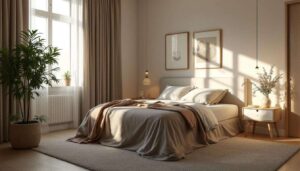
Contemporary pastel palettes feature dusty, nuanced tones with grey or brown undertones that prevent them from appearing juvenile. Soft peach, muted lavender, and gentle sage represent this new generation of pastels, offering subtlety and refinement that works beautifully in British homes.
| Pastel shade | Undertone | Effect |
|---|---|---|
| Soft peach | Warm terracotta | Welcoming glow |
| Dusty lavender | Grey-purple | Sophisticated calm |
| Gentle sage | Grey-green | Natural serenity |
Creating elegant spaces with pastels
The key to successfully incorporating pastels lies in layering and texture. Designers recommend pairing these soft hues with natural materials like linen, oak, and stone to prevent spaces from feeling insubstantial. Pastel walls provide an excellent backdrop for statement furniture and artwork, allowing decorative elements to shine whilst maintaining an overall sense of tranquillity.
For those seeking a more dramatic departure from grey, bolder options offer an entirely different energy.
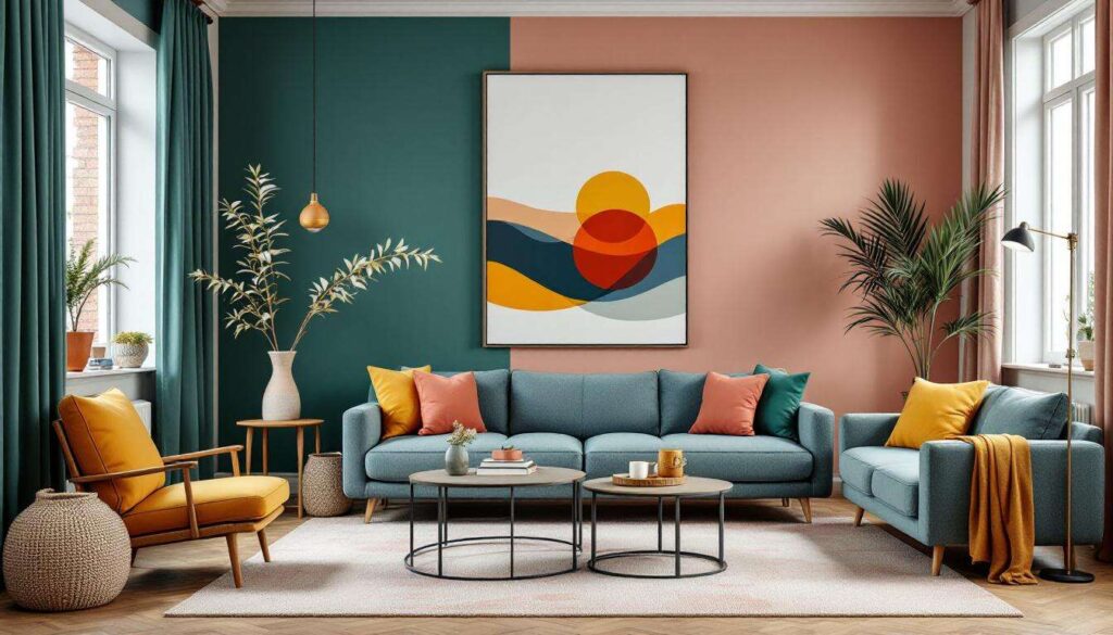
Bold colours for an energetic style
The embrace of bold colours marks perhaps the most significant shift away from grey’s cautious neutrality. Rich burgundies, deep teals, and vibrant yellows are finding their way into British homes as homeowners gain confidence in using statement-making hues.
The psychology behind bold colour choices
Selecting bold colours represents a conscious decision to create spaces with personality and impact. These shades demand attention and create memorable interiors that reflect the occupants’ confidence and creativity. Designers note that clients requesting bold colours often seek to make their homes feel distinctive and personal rather than adhering to market trends.
- Burgundy creates intimate, cocoon-like atmospheres
- Butter yellow energises and uplifts mood
- Deep teal adds sophistication with a contemporary edge
- Bold colours work surprisingly well in small spaces when applied thoughtfully
Strategic implementation of strong hues
Successful use of bold colours requires strategic planning. Designers typically recommend the 60-30-10 rule: 60 per cent neutral, 30 per cent secondary colour, and 10 per cent bold accent. This approach allows strong colours to make an impact without overwhelming the space. Feature walls in burgundy or teal can anchor a room, whilst butter yellow works beautifully in spaces used primarily during daylight hours.
Regardless of which colour direction appeals most, implementing these new palettes successfully requires thoughtful planning and expert guidance.
Designers’ tips for harmonising these colours in your home
Transitioning from grey to these emerging palettes demands careful consideration of how colours interact within your specific space and lifestyle. Professional designers offer practical strategies for achieving cohesive, beautiful results.
Assessing your home’s unique characteristics
Before selecting colours, evaluate your home’s natural light, architectural features, and existing elements. North-facing rooms benefit from warm tones like terracotta and peach, whilst south-facing spaces can handle cooler pastels or bold colours without feeling cold. Consider fixed elements such as flooring and cabinetry, ensuring new wall colours complement rather than clash with these features.
Creating flow between rooms
Maintaining visual harmony throughout your home prevents a disjointed feel. Designers recommend selecting a core palette of three to four colours and varying their intensity across different rooms. This approach allows each space to have its own character whilst maintaining overall cohesion.
- Use lighter versions of your chosen colour in hallways
- Repeat accent colours in soft furnishings across rooms
- Consider sightlines when selecting colours for adjacent spaces
- Use woodwork colour to unify disparate room colours
Testing before committing
Professional designers unanimously recommend extensive testing before painting entire rooms. Purchase sample pots and apply large swatches to multiple walls, observing how colours appear in different lights throughout the day. What appears perfect in morning light may feel entirely different by evening, particularly in Britain’s variable natural light conditions.
The shift away from grey towards warmer, more characterful colours represents a significant evolution in British interior design. These five emerging palettes offer homeowners the opportunity to create spaces that feel personal, welcoming, and emotionally resonant. Whether drawn to the grounding quality of earthy terracottas, the gentle sophistication of modern pastels, or the confident energy of bold hues, there exists a palette to suit every taste and home. By carefully considering your space’s unique characteristics and following designers’ guidance on harmonisation and testing, you can successfully embrace these new colours and create interiors that truly reflect your personality whilst remaining timelessly appealing.